Hozuki Books
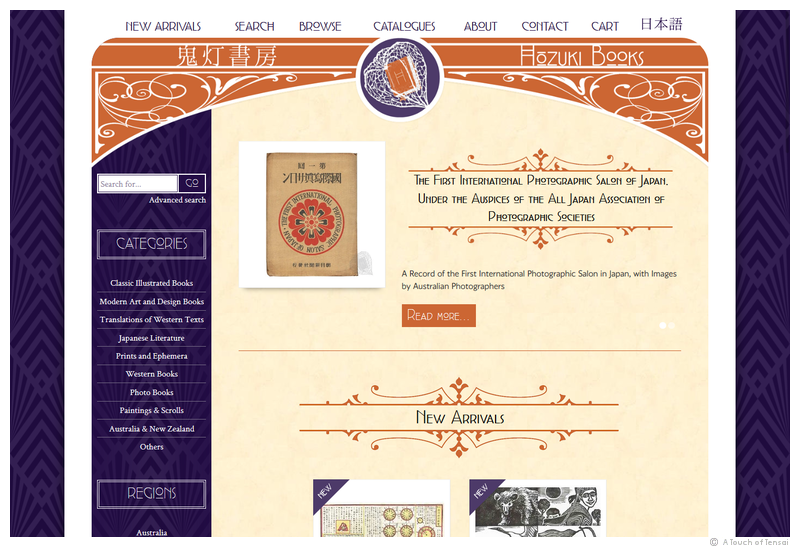
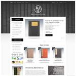
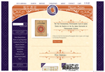
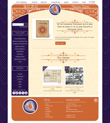
This was a very unusual request for a design - art nouveau influences and Japanese 1920s styling, in shades of burnt orange and eggplant! All topped off with a unique logo incorporating a chinese lantern plant (called hozuki in Japanese).
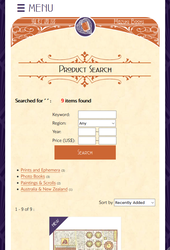
Themed fonts and decorative flourishes were great fun to decorate this fully functional and responsive online shop for rare Japanese antique books!
URL: https://www.hozukibooks.com
More images:
(Web Design ::: Tokyo)

Owner Testimonial:
 From our first Skype call David was very helpful and positive about the project. He created a fantastic logo that perfectly represented the brand, and went above and beyond to put together a website that I was completely satisfied with. As David's pickiest customer yet I had many small changes that I wanted made, and David very patiently went through each one of them until I was happy with the result. His ideas on the website design were invaluable, and many of the edits I wanted made we changed back to David's original designs because, from the start, his experience meant that he knew what designs looked good where, what fonts correctly represented the brand, and so on. I cannot thank David enough for creating such a professional-looking website for me, and can highly recommend his services to anyone looking to make a website.

Owner, Hozuki Books ::: Hozuki Books
• NEXT: KitaQGamers Club Website >>


 ENGLISH


