 Custom Websites only 140,000yen

 ENGLISH
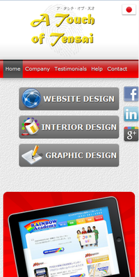
 WEBSITE DESIGN
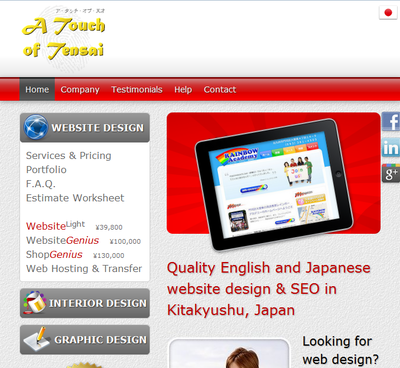
 INTERIOR DESIGN
 GRAPHIC DESIGN


 Very happy with Bakumatsuya as if I google "rare Japanese books", it seems to be the first or second site that appears! That means I get all sorts of inquiries!
HELP

HELP >
Mobile Devices & Responsive Design
It is thought that currently around 50~60% of internet viewing is done on mobile devices such as iPhones, smartphones, iPads or other tablet computers. However, converting sites to look their best on this wide variety of devices is still a relatively new trend.
If you are keen on having your site converted in this way, we would recommend using the concept of "Responsive Design". Basically, this means that your website's layout will stretch or contract to fit the screen of the viewing device. Our own site has been updated in this way, so if you viewed our own site on an iPhone, you'd see that the margins have been reshuffled to work vertically, and the whole page is oriented up down, rather than left-right as on a normal computer screen.
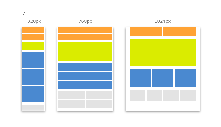
This style of design has a few limitations in terms of layout, but generally these are not important and we can make these updates in a few days. Please contact us for further details.
Examples:
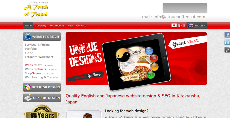
Full-width PC version:
Medium-width iPad version:
Small-width iPhone version: